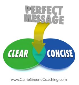
What’s the best way to capture, and hold someone’s attention?
You can find business lessons anywhere and everywhere. I was out for a walk and noticed the lawn signs that contractors put up when they do work at a house. I started to pay attention to which signs I was attracted to and which did not interest me. I learned a powerful lesson in messaging and how to communicate with the people you interact with as I walked.
I saw a lot of signs, I’m going to focus on two signs in particular. They are both local painters.
 Obvious Business Lessons
The first sign was for Alberto Del Priore. Looking at the sign it was clear that someone spent a lot of time designing it. It isn’t a standard rectangle and it uses a variety of font types and sizes. There are three colors on it, in addition to their rainbow logo. According to the sign, they’ve been in business since 1965, are the finest interior painters, and do custom painting, restoration and wall coverings. They do not subcontract and are licensed. The sign includes the company’s phone number and website. Lots of great information. I got the feeling that these guys know their craft and do quality work.
The second sign I saw was for Wilber’s Painting. It was a simple rectangular sign and very straight forward. It has the company’s name and phone number with the words “Painting Interior and Exterior”. It includes their New Jersey license number in a tiny font. It only has two colors on it. From the sign, I could not get a sense of how good their work would be.
The second sign was better. Here’s why.
It was clear. I was immediately able to understand what they do and determine if I was in the market for the service being offered. If I was, I knew how to get more information.
Remember, these signs are lawn signs and meant to be viewed by someone moving at 25+ miles an hour.
The only reason I noticed the first sign, and was able to understand the first message, was because I was going at an unusually slow pace for that location. If I was driving, I doubt I would have known the sign was for a painter, let alone take in the entire range of services they offer. Wilber’s Painting sign was clear and easy for me to consume. If I was driving past it, and looking for a painter, it would have caught my attention. If I was interested I could have stopped to write down the contact information.
Your prospective clients move fast too. There are many things that vie for their attention from emails, to pop-up ads, phone calls, text messages and even the ideas that cross through their minds. As a business owner you are lucky if they give you a few seconds to grab their attention. It’s your job to make sure that, if you are given the opportunity to present your message, you deliver it clearly and concisely, using as few words as possible in simple language.
Do not go into detail until you have their attention and they’ve stopped to listen to you. It will overwhelm them and muddy your message.
 Even though the example I used here is based on physical signs I saw, this holds true however and whenever you interact with a prospect. For instance, if you meet someone at a networking event what you say first needs to be short and easily understood. The person you are talking with needs to be able to determine quickly what you do and whether or not you are someone they want to get to know better. It’s good for you and it’s good for them.
There are certainly times in your business that a longer, more involved and complex message is absolutely appropriate. The first thing you must do, however, is get their attention in the first place.
Here are three takeaways for you to use with your business.
- Pay attention to where and how your message will be seen or heard. You never have more than a few seconds to grab someone’s attention. There is a huge difference between two and seven seconds.
- Make it easy for someone to grasp whether or not they need your service. Don’t use fancy words, industry jargon or worse, cute made up words. When you get a few seconds of someone’s time you don’t want them to spend it wondering what you’re talking about.
- Provide a call to action. Let them know how to get in touch with you or ask you for more information.
What is the core of your marketing message? Share it here and I’ll be happy to give you feedback on it.

I also like the second one the best. It is clear and it tells me what I want to know. Once I call them I will find out how long they have been in business, what they do best, etc. etc.
I love the fact that they have a telephone number!!!
Gite – you are the queen of the phone so the number is absolutely key!
And you know the saddest thing… I bet the 1st painter is amazing but the message is lost in the signage.